Browse help topics
Dashboard overview
Three tabs: Today is the action queue, Operations is roster health, Finance is the money picture.
Last updated · 2 August 2026
The Dashboard is your summary of the operation. Open it from Dashboard. The page is headed Dashboard with the subtitle “Operations, finance and care at a glance.” and has three tabs: Today, Operations and Finance.
Today is the one you work from. It is a worklist, and almost everything on it opens the register behind it. Operations and Finance are read-only analysis.
Watch out
If your account is not yet linked to a provider workspace, the Dashboard shows a No provider workspace banner instead of any data (“This user is not linked to an active provider workspace yet.”). If a widget fails to load for any other reason, it shows a red error banner in its place with the underlying error message.
Today tab
Everything waiting on the office, worst first, then the deadlines, then the money.
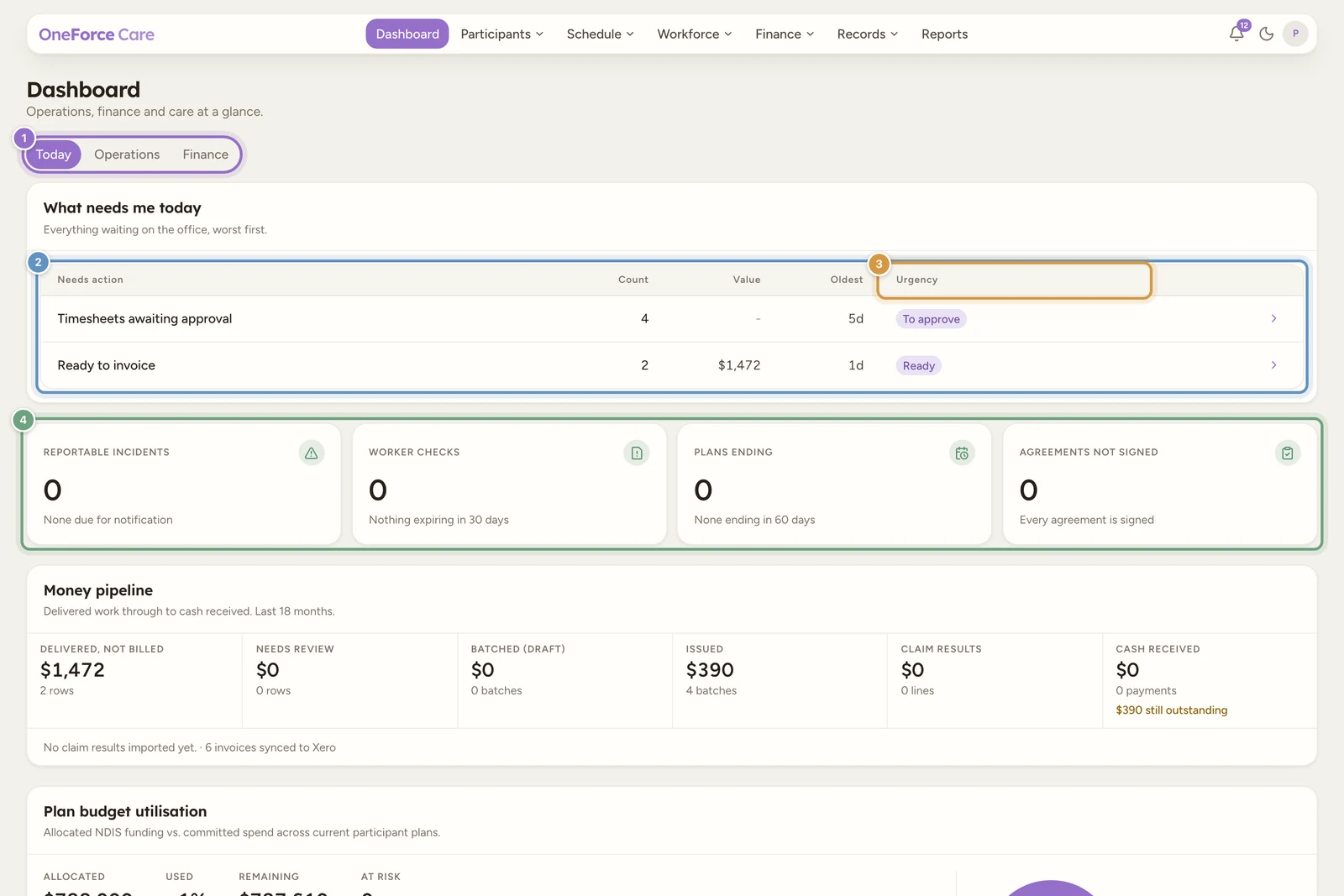
What needs me today
“Everything waiting on the office, worst first.” Five columns: Needs action, Count, Value, Oldest and Urgency, with a chevron that opens the matching register.
A row only appears when it has something in it, so an empty queue is a short queue. When nothing is outstanding at all, the card reads Nothing needs you right now with “No overdue items, no expiring checks and nothing waiting to be invoiced.”
| Row | What it counts | Opens |
|---|---|---|
| Shifts need a worker | Shifts with nobody allocated. | Scheduling |
| Timesheets awaiting approval | Clocked-off assignments the office has not approved yet. | Assignments |
| Finance rows need review | Finance rows blocked in Needs review. | Billing |
| Ready to invoice | Reviewed rows waiting to be batched. | Billing |
| Claim lines rejected | Claim lines the NDIA sent back. | Payments |
| Incidents past reportable deadline | Open reportable incidents whose notification deadline passed. | Incidents |
| Worker checks expiring | Worker compliance items expiring or already expired. | Workers |
| Plans ending | Current participant plans coming to an end. | Participants |
| Agreements awaiting signature | Service agreements drafted or sent but not signed. | Participants |
| Tasks overdue | Tasks past their due date. | Tasks |
Value is filled in only for the money rows; the others show a dash. Oldest is the age of the oldest item in whole days, and is blank on rows that look forward rather than back.
Urgency is what sets the order. Passed deadlines and lost money come first (Overdue, Expired, Rejected), then things going stale (Needs review, Due soon, Going stale), then your own next actions (Ready, To approve), then the merely informational (Awaiting signature, Upcoming). Ties break on age, then on the largest amount.
The deadline clocks
Four tiles under the queue, each one a link:
| Clock | What it counts |
|---|---|
| Reportable incidents | Open reportable incidents due for notification within 24 hours or already past, with how many are past deadline. |
| Worker checks | Worker checks expiring within 30 days, with how many have already expired. |
| Plans ending | Current plans ending within 60 days, with the soonest date. |
| Agreements not signed | Service agreements still in draft or sent, with how many are sent and awaiting signature. |
A zero is genuinely good news on all four, so a zero clock reads green (“Nothing expiring in 30 days”, “Every agreement is signed”) rather than red.
Money pipeline and the rest of the tab
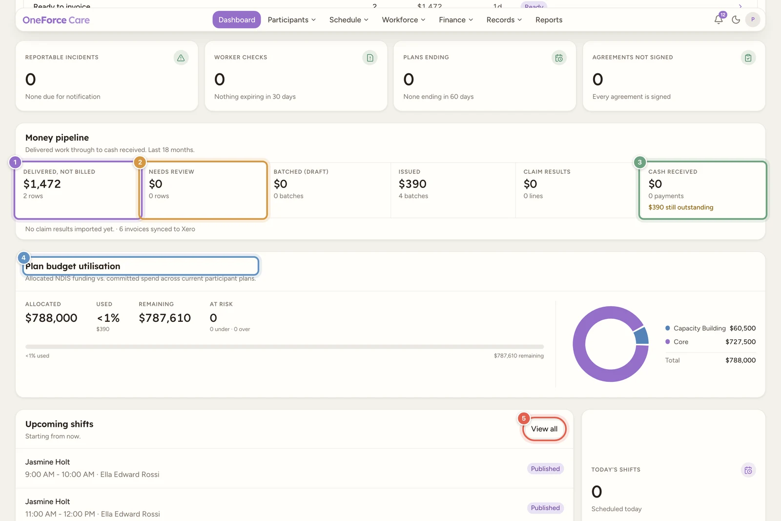
Money pipeline (“Delivered work through to cash received. Last 18 months.”) is one rail of six stages, left to right, each showing an amount, a count and a link to the register behind it:
- Delivered, not billed: finance rows for delivered work not yet on a batch.
- Needs review: rows blocked in review. A chip appears when any of them is more than 30 days old, because a row that old has stopped being a queue item.
- Batched (draft): draft invoice batches.
- Issued: finalised batches.
- Claim results: NDIA claim lines returned, with a chip counting rejections.
- Cash received: payments and recoveries recorded, with anything still outstanding on issued batches underneath.
A line under the rail splits the claim outcomes into Accepted, Rejected and Paid partial, with matched and unmatched counts as a muted detail. Once invoices have gone across to Xero, the same line ends with a count of them, for example “6 invoices synced to Xero”. Until any claim results are imported it reads “No claim results imported yet.”
Plan budget utilisation totals every current participant plan:
| Figure | What it counts |
|---|---|
| Allocated | The full dollar amount allocated across current plans. |
| Used | The percentage committed, with the dollar figure underneath. Committed spend already includes anything invoiced, so nothing is counted twice. |
| Remaining | Allocated minus used. |
| At risk | Plans flagged Over or Under, with the split underneath. Over means more than 100% of the allocation is used. Under means the plan ends within 90 days with less than 60% used. |
The donut alongside splits the allocated total by support category (Core, Capacity Building and Capital), each with its dollar value and a Total.
Upcoming shifts (“Starting from now.”) lists up to five shifts from right now onward, in start-time order, so it can reach into tomorrow if today is nearly done. Each row shows the participant, the time range and the worker, a status badge, and up to two warning badges (Unassigned, Unpublished, Expired worker check). View all, in its header, opens Scheduling and only appears for owners and admins. Beside the list, Today’s shifts counts what is scheduled to start today.
Operations tab
Roster health and compliance over the recent past. Read-only.
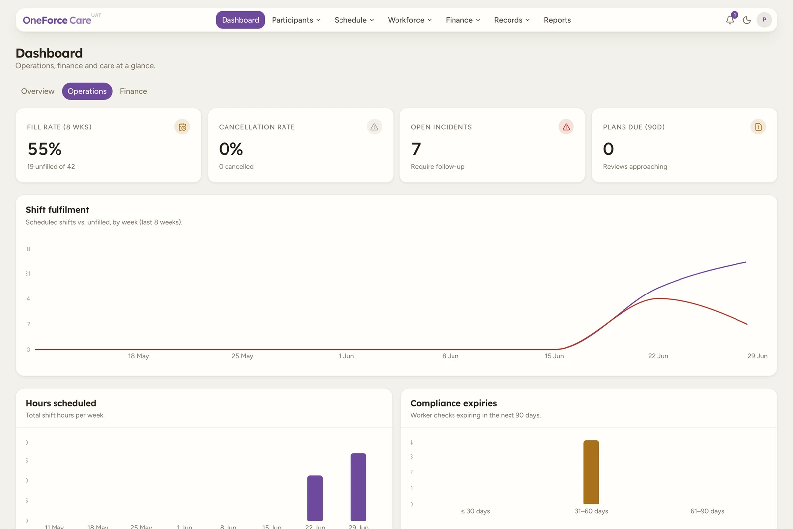
| Widget | What it counts |
|---|---|
| Fill rate (8 wks) | Share of shifts filled over the 8 weeks ending this week, with the unfilled-of-scheduled count underneath. With nothing scheduled it shows a dash and “No shifts scheduled in range”. |
| Cancellation rate | Share of shifts cancelled over the same window, with the cancelled count underneath. |
| Hours scheduled (8 wks) | Total rostered hours over the window, with the average per active week underneath. |
| Timesheets to approve | Clocked-off assignments waiting on the office, with the age of the oldest. The same figure as the Today queue’s row, and it opens Assignments. |
| Shift fulfilment | Line chart of scheduled shifts versus unfilled, by week over the last 8 weeks. |
| Hours scheduled | Bar chart of total shift hours per week over the same 8 weeks. |
| Compliance expiries | Worker checks expiring in the next 90 days, bucketed by days left, plus a list of up to six upcoming expiries. Checks marked “not required”, or with no expiry date, are not counted. |
| Shift status | Donut of the shift status mix across the last 8 weeks. |
| Worker compliance | Donut of every non-archived worker by status: Current, Expiring, Blocked, Missing, or Not Required. |
| Incidents | Donut of incidents, open and resolved, by status. |
Finance tab
Budgets, ageing and revenue. The invoiced, settled and outstanding totals are deliberately not repeated here: they are stages of the money pipeline on Today, in the order the money actually moves, and each one is clickable there.
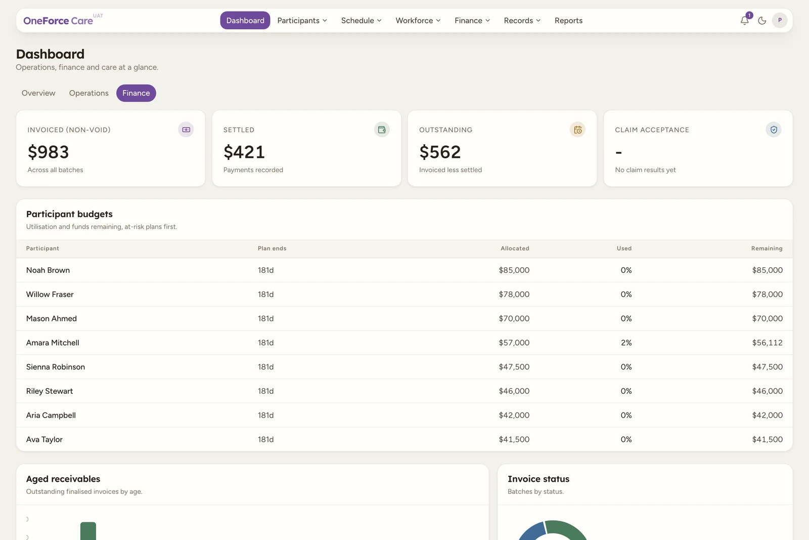
| Widget | What it counts |
|---|---|
| Participant budgets | Up to eight current participant plans, at-risk plans first (Over, then Under, then everyone else), then soonest plan end, then largest allocation. Plan end shows in days, in red at 30 days or fewer, or a dash if no end date is set. |
| Aged receivables | Bar chart of outstanding finalised invoices by age, bucketed 0-30, 31-60, 61-90 and 90+ days, aged from each invoice’s date against what is still outstanding on it. |
| Revenue by month | Bar chart of invoiced totals (excludes void) over the last 6 months, by invoice date. |
| Revenue by funding type | Donut of invoiced totals (excludes void) by funding management type. |
Tip
These are summaries. To pull the underlying records, build a custom export on the Reports Data export tab, or have one emailed to you on a schedule with Scheduled reports.